
Graphics
 Model names should be readable but not huge. It's hard to think up good ones. Birds and mammals have been popular. So have mountains and cities or regions in Italy. All the numbers have been used. If you think it's easy, then think of a good one in the next five seconds, or even seven seconds, and send it in. If we use it, we'll give you ten million dollars.
An obvious and common solution is to call the bike the name of the designer or builder, or the company name with "road," or "touring" or "something like that" after it. That sometimes works and sometimes doesn't. In Rivendell's case, that would mean I'd have my name all over the place, and that's just too embarrassing and weird for me. Nothing would feel more unnatural. So we could just call all of our bikes "Rivendell" and then call the road model (which is now the Roadini) the Road, and the touring model (now the Atlantis) the Tour, and so on. But then we'd have to put that name on them somewhere, presumably on the top tube, and I don 't like top tube decals. Plus, it would pigeon-hole the bike too much; so I'm glad we don 't do that.
Ninety-nine percent of bicycle model names are spelled out in all UPPER CASE. Most of our models use mixed cases. That wasn't the plan, it's not the high road, it's just how it worked out, and nobody notices or cares (which is as it should be).
Bicycle paint jobs shouldn't interfere with the shape of the frame with multiple interruptions (color changes on tubes). Brand or model names shouldn't sound like inside jokes thought up over beer & pizza.
The downtube decals should be readable from 15 feet. They should be between 6 and 8 inches long, and positioned on the upper portion of the downtube, more toward the head tube than the bottom bracket. The letters should be "rolled" a bit toward the top centerline of the tube, because they're viewed from slightly above.
Model names should be three syllables if possible, but two works in a pinch, and five works if you have a stunning lightening-bolt of a name, such as A. Homer Hilsen.
Seat tube decals should be positioned about 50 to 60 percent UP from the bottom bracket. Top tube decals are always suspect. It's best not to have one, but if you must, keep it so small that nobody knows it's there.
Panels are okay either on the downtube or seat tube, but if you put them on both, the bike looks like a race bike or an advertisement; or it looks as though you're trying too hard to look too classic.
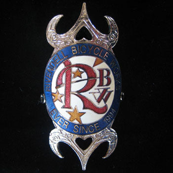
Head tube badges are always preferable to decals. It would be foolish to buy any bike for its badge, or to avoid a good bike because it lacks a badge. But when all the good things collide, a good bike has a good badge.
Head tube badges cost anywhere from $0.30 to $7.50 each, not including the tooling for them, which can run as little as $200 and as much as $1500. Today's best head badges are special, but there are Japanese badges from the '50s that, while not as good technically, are more interesting beautifully. They were stamped in high relief from thin brass or brass-like something else, and were painted by hand imprecisely, but you can't tell from a distance apart. They often had fake, translucent jewel-like things embedded in wonderful but unnecessary places. They look real to me, but nobody has ever accused me of being gem-man.
Cheap bikes up through about the early '70s often made what you could call cheap and tacky attempts to be classy. Chrome-plated caps over ugly fork crowns, chrome on the lower six inches of fork blades, pin-striping where it's not necessary, and so on. At the time I saw them as horrid details, a joke, but I've completely turned around now. They're a sign that somebody cared about looks. They were working with tight budgets and doing as much with them as they could. Far better than just spraying a bike bad-boy matte black and being done with it and thinking it's cool.